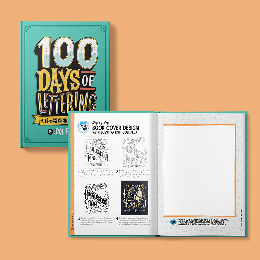
Congratulations to the talented Jay Roeder for getting his book "100 Days of Lettering: A Complete Creative Lettering Course" published. I'd also like to say thank you to Jay for including me in this project among other talented guest artists, and allowing me to share a snapshot of my lettering process.
Jay has several sections of lettering applications in this book from personal projects to real-world assignments. I chose to redraw a classic novel title "The Adventures of Huckleberry Finn" by Mark Twain. There have been many talented designers and artists take on this cover but it was fun to put my own spin and style to it. Below you can see the progression from a simple thumbnail sketch to a more refined composition.
This book is a must have for all aspiring lettering artists and those looking to explore Jay's unique and funky style of typography. So pick up your copy today to add to your library and expand your skillset!
One of my projects was recently highlighted in the book Scripted: Custom Lettering in Graphic Design by Flamant Publishing. Very honored to be included among so many talented designers and lettering artists. Pick up your copy today!
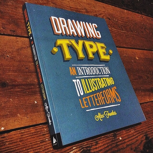
If you're into hand-drawn type, and crafting your own letterforms like I am, then you're probably always looking for resources to perfect your craft. There are a ton of great books out there and even more people who really do this sort of thing extremely well. I don't consider myself a "master" by any means but I do enjoy this mode of design and illustration. Maybe it's my background in Art, or maybe I just hate being in front of a computer all day. Either way lettering and typography has been one of my greatest passions and has lead me to some great projects and allowed me to cross paths with some extremely talented people. I'm very honored to be included in this new book published by Rockport Books, titled Drawing Type: An Introduction to Illustrating Letterforms by Alex Fowkes
Drawing Type: features real-world projects and sketchbooks of well-known type designers (and some not so well-known like myself), including interviews about their processes.
Typefight... where the points don't matter, the winner gets bragging rights and the loser walks away scarred for life. Mano y Mano, glyph against glyph in a knock-down, drag-out fight to determine the best "Letter" of the two. I've been put up against the extremely talented UK designer Ged Palmer. We both put our lettering skills to bout for one week's time and let you — the audience — decide who's "N" is better.
You can cast your vote on the Typefight website.
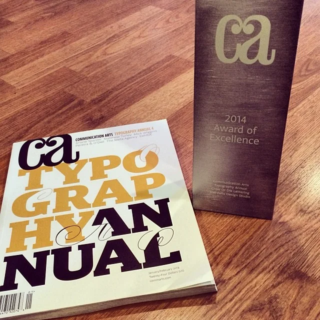
To be included in the 2014 Communication Arts Typography Annual is an extreme honor. Especially when I saw the level of talent that surrounded me in the publication. People that I've looked up to (and still do) since I was in design school. Including the ever talented Erik Marinovich as one of the judges!
It hasn't' been easy working to reach my goals. Sometimes I feel like I'm years behind where I should be at my age but things like this remind me I'm on the right track and need to keep striving forward.
It's quite amusing to look at my body of work over the last several years and notice that the most successful pieces are the ones that are more of a self-initiated personal project. Don't get me wrong, I love some of the client work I've done, but it's those ones that I build from the heart with a simple joy that keep my passion for design alive. Which makes it even more gratifying to have them recognized by my peers. All in all a great way to start 2014.