Typefight... where the points don't matter, the winner gets bragging rights and the loser walks away scarred for life. Mano y Mano, glyph against glyph in a knock-down, drag-out fight to determine the best "Letter" of the two. I've been put up against the extremely talented UK designer Ged Palmer. We both put our lettering skills to bout for one week's time and let you — the audience — decide who's "N" is better.
This Mother's day weekend was spent in beautiful Napa Valley at the inaugural BottleRock Festival where 60+ bands including The Black Keys, Kings of Leon, Zac Brown Band, Alabama Shakes, The Shins and so many more rocked my face off. On top of the great music was an excellent assortment of fine Napa culinary treasures, Tons of wineries representing "Napa Valley's Best," A hit list of top comedians spitting their best lines, and plenty of Beer.
I've never been a "music– festival" going type person but I could't miss this one, especially after having the fortunate opportunity to be involved in BottleRock since it's concepting phase. It was September of 2012 when I sent initial logo comps to my good friends at Plumbline for critique, and they were definitely "works in progress." We came a long way developing the logo and several illustrations used to brand the entire event.
Dom Moreci and the team over at Plumbline had all the hard work implementing all the design collateral, but as you can imagine, it was extremely rewarding to see my illustrations and logo on EVERYTHING from wine bottles to stages. BRNV by far has been one of the biggest events I've been a part of. I was glad to share creative prowess with such a talented group of designers and will look forward to being a part of next years BottleRock endeavors.
Willpower Stage + Best Coast
The illustration comes to life
Official BottleRock Schedule
The only "bottle's" used the entire branding of BottleRock. That was intentional.
Citi Stage
Miner Family Winery Stage
Fence Covering
Yesterday I went on an adventure into the world of Letterpress printing at the San Francisco Center for the Book, where I gained a deeper appreciation for a dying art and the amount of patience and meticulous attention detail necessary to make a beautiful print. Accompanied by Kyle Marks, we approached the foreign process with a gung-ho attitude, rolled up our sleves and dived right in.
As designers we were familar with many of the typographic terms such as "Leading" and "Kerning," and we were totally geeking out at all the different typefaces they had to choose from. Our weapon of choice for the evening was 18pt Bodoni Ultra which was paired with a sans-serif wood type and lino-block triangle pattern that one of the students of the SFCB had already produced. Our assignment was to finish the phrase "You are..." with our own hand-set type. While the other students were being serious and cliche with prhases like "You are...Radiant & Beautiful" Kyle and I had our own interpretaion of the assignment.
Mine reads
"You Are the cheese to my macaroni."
while Kyle's read
"You Are the butter to my biscuit."
You can view a short little video of I shot here showing the printing process of the lino-block. It was a great experience and if they offered anything like this in the Sacramento area I would defintely be there more often. If your interested in learning about letterpress printing I would recommend visiting SFCB and taking a class. At a mere $40 you can get your feet wet in letterpress printing. They also have opportunities to get certified and even come and do your own thing during open studio hours. Sounds like a good deal to me.
Thank you to all those who expressed interest in this project and helped me to take it to the next level. I'd especially like to thank Kyle Marks of Interval Press who helped me silkscreen these, and Kenji Enos a.k.a Kenjiboy who made this fabulous video documenting the process.
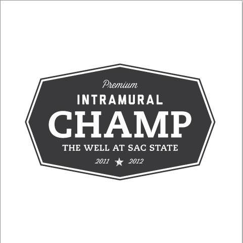
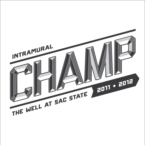
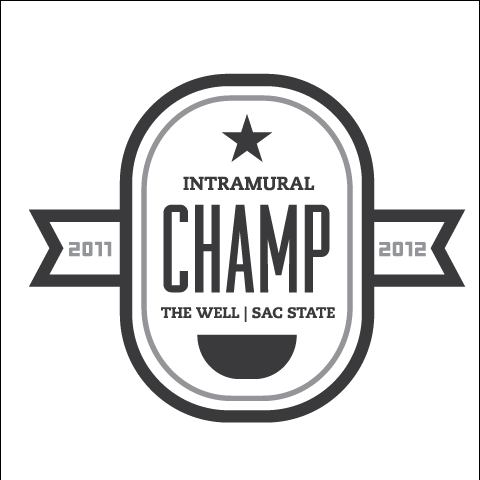
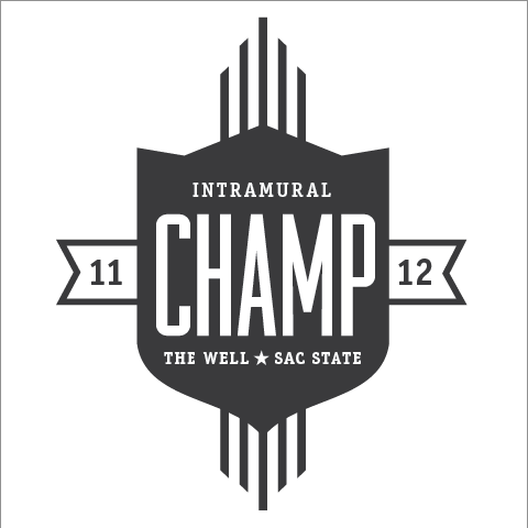
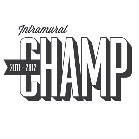
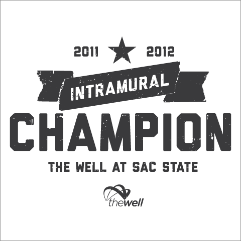
Here are some concepts I've worked up for a t-shirt given to all champions of Intramural sports during the 2011-2012 school year. They're pretty straight forward, I wanted to do a type only solution that would have a retro feel. Some still need to be refined but If you'd like to let me know which one's you like please leave a comment. Thanks!
